Category: Branding

10 Apr 2017
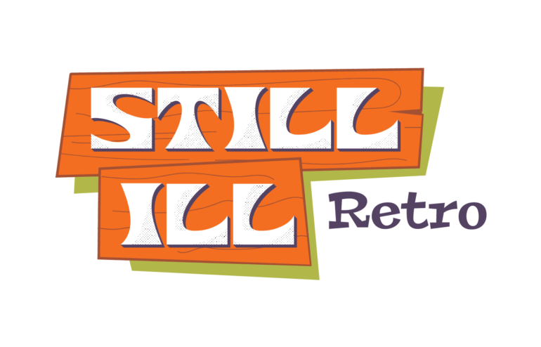
Still Ill Retro Logo

Still Ill Retro Logo

Lee Daniel is the keen eye behind Still Ill Retro, a vintage store inside of Kudzu Antiques.

I met Lee around 2016 after following an ad for a GE speaker cabinet — a killer find, by the way. When I arrived to pick it up, he welcomed me into his stunning atomic ranch. Every nook and cranny was filled to the brim with MCM style. I’ve been close friends with Lee and his husband, Joe, ever since.

So, Lee not only sells precious relics from a distant era, he lives it. That why I felt a strong obligation to show his degree of passion in the logo.

The typographic elements reflect lettering of the 1960s and 70s, his main focus. I used halftone dots as a nod to analog printing, and I slightly distressed them, as if to age the logo itself. His inventory naturally has a lot of orange, so I was compelled to include an orange in the color palette. I based the final swatch off of a Mark Rothko print he had for sale at the time.

You may also notice a wood motif going on. Originally, there were even quirky little nails in the design. This was all to hint at another passion of Lee’s — he is highly skilled at refinishing furniture. See for yourself! Visit his two booth spaces at Kudzu Antiques. They are on the righthand side, one of the first few spots on the right after you go up the ramp.

26 Mar 2017
Portfolio Piece - Puerto Rico Aid for Dookie Platters

Puerto Rican Relief Flyer

This is a pro-bono flyer I did to aid Puerto Rico following Hurricane Maria in 2017.

The dance night was organized by “Atlanta’s deejay and friend,” DJ Dookie Platters. Here is how he explained it on his Instagram.

I noticed a few friends have set up donation drop-off points to gather goods for hurricane relief efforts and I thought I’d set up another way to help. Drop your donations off Friday night at @elmyrbar (right into my car our front) and l’ll drive them up Saturday morning to @buenprovechoatl in Marietta. They’ll be making arrangements to ship supplies where relief is needed.

We even included an accompanying image on the various social media posts to clarify what to do, showing off Dookie’s sweet station wagon. Really though, the guy has a big heart.

Accompanying image for social media
28 Feb 2017
Dookie Platters Logo

The Dookie Platters Logo

Dookie Platters is an Atlanta gem. He’s certainly one of the most hardworking DJs in the game right now. I’m sure you’ve seen him at one of your favorite bars, spinning classics and obscurities from his vast collection.

I think Dookie put it best.

From nightclubs and dive bars to festivals, fundraisers, and weddings, I’ve  done it all.  After serving as the master of ceremonies for  retired space-funk band  Noot d’ Noot, I’ve continued to spread the message of positive partying through great tunes and good times.

He wanted a logo that reflected his catalog. I designed the lettering to give a nod to the funky 60s and 70s. I also incorporated the 1980s using the decade’s fascination with horizontal lines and repetitive geometry. He wanted an island aesthetic as well, so I introduced the warm colors.

Dookie was beyond pleased with his new logo and even produced limited edition swag for sale on his website.

20 Jun 2014
Banking Bits and Bytes with Brendan Thumbnail

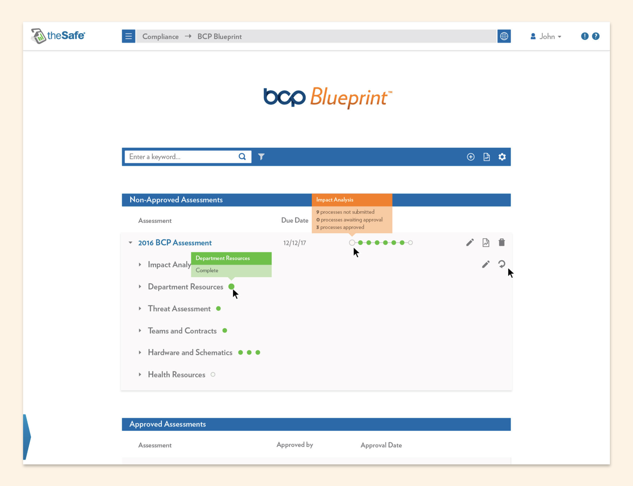
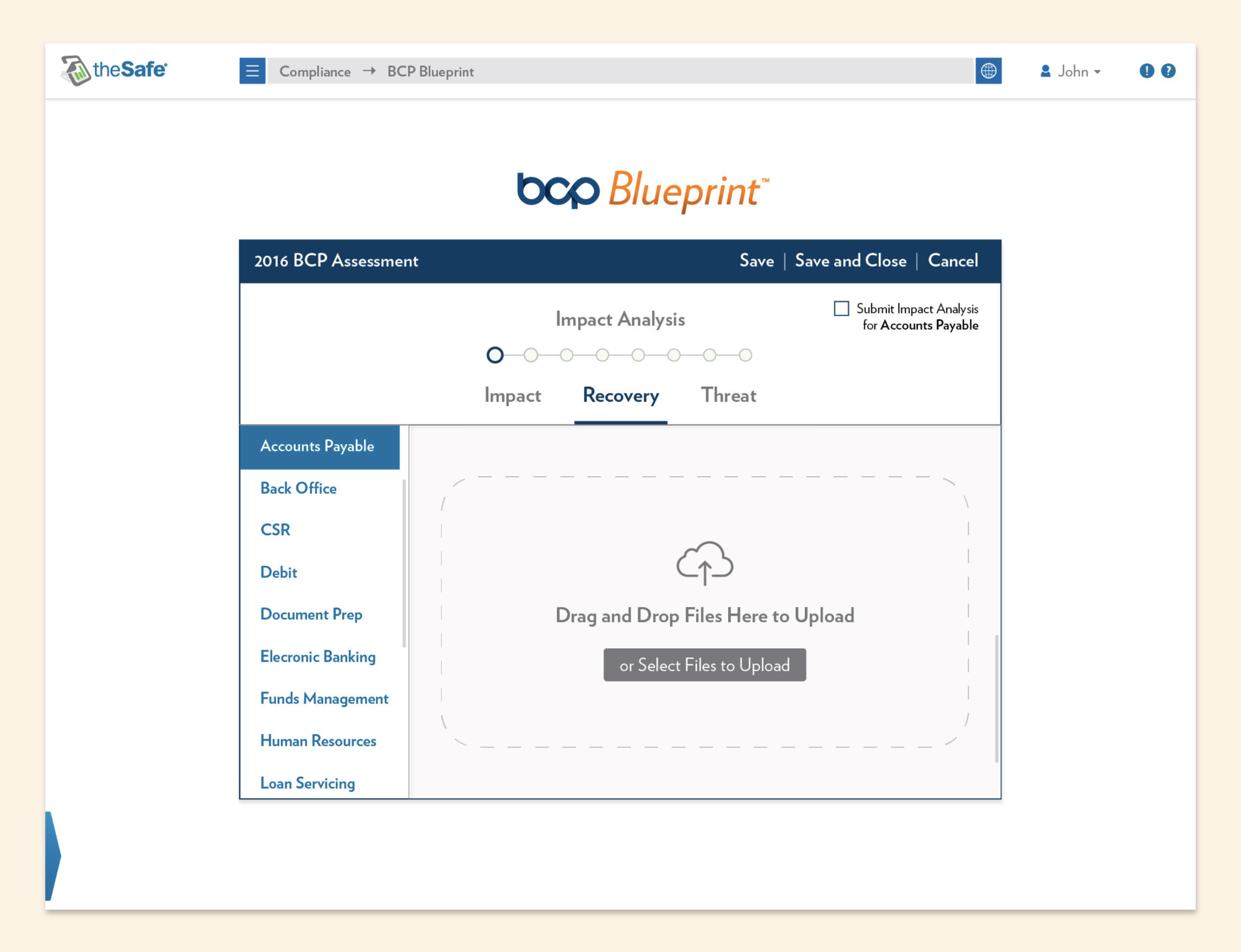
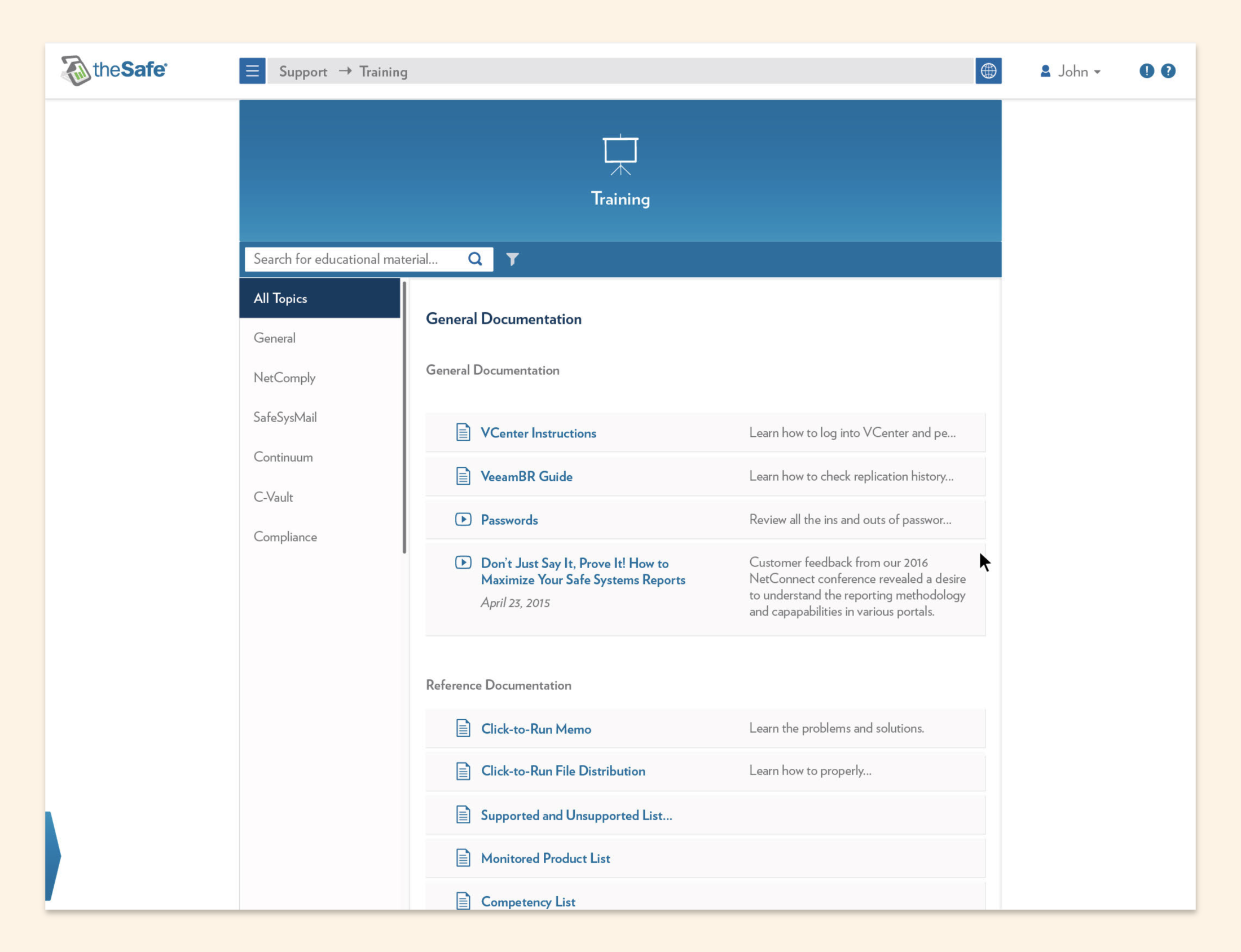
Banking Bits & Bytes with Brendan Video Series

Banking Bits & Bytes with Brendan was an ongoing educational video series hosted by Brendan McGowan, a cheeky subject matter expert in banking technology and security.

I was a one-person production team for the show, where I handled the storyboarding, lighting, cameras, audio capture, timeline editing, color correction, sound design, and motion graphics. I also created the marketing emails and social media used to promote the series.

The episodes are also fairly short, and you can watch all of them on YouTube.

16 May 2014

#SaveWRAS Movement

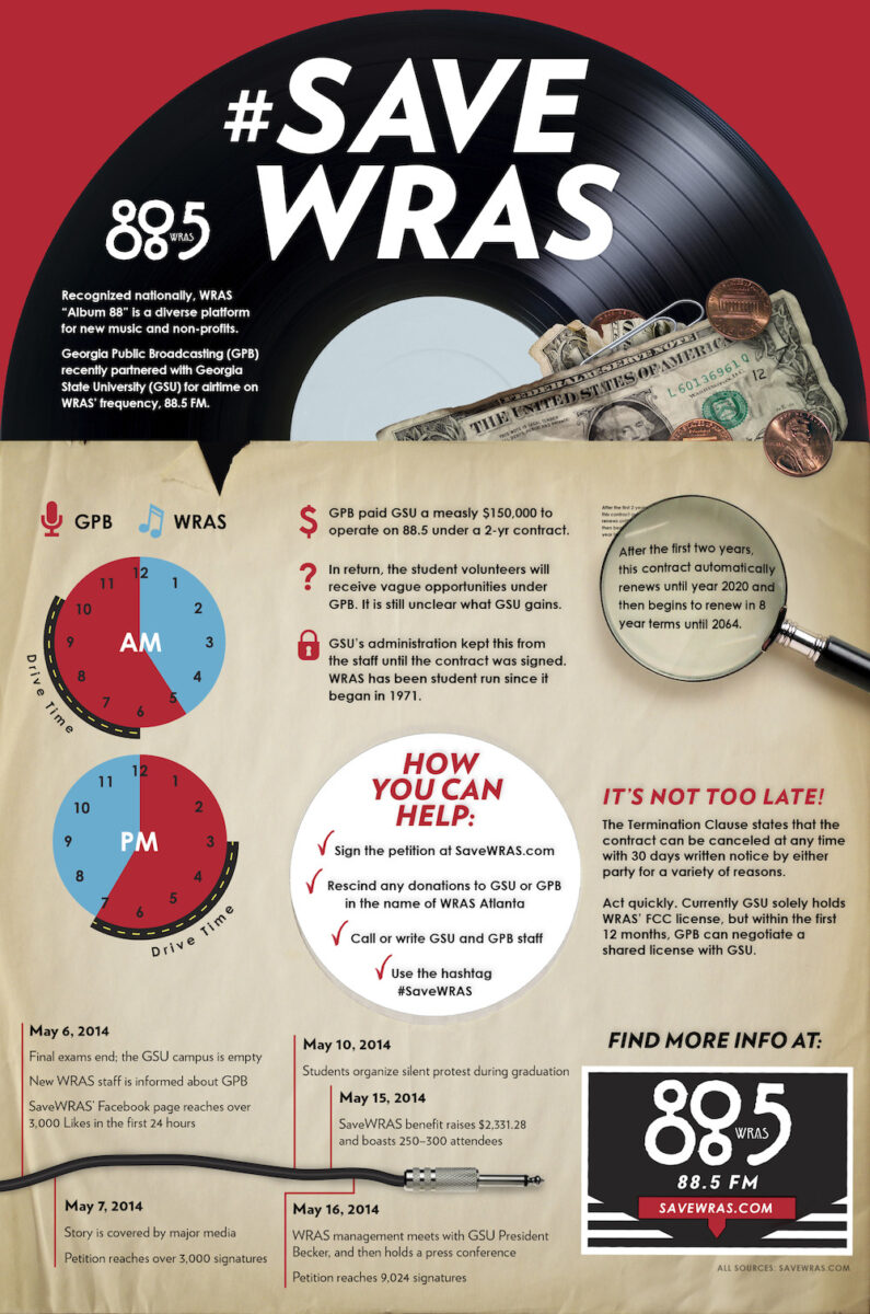
Many Atlantans remember “Album 88,” or WRAS Atlanta, Georgia State University’s 100,000 watt student-run radio station as it was before 2015, when Georgia Public Broadcasting (GBP) strategically stole the airwaves from the student DJs.

The public was outraged. Station supporters went to social media with the hashtag #SaveWRAS and waged war with peaceful protests, a press conference, and a benefit concert named WRAS-stravaganza. I was involved in many of these efforts, as well the designs that accompanied them. Sadly, on June 2, 2014, the contract with GPB went into effect.

Infographic

Save WRAS Infographic

Concert Poster

WRAStravaganza Poster

WRAS was once widely regarded as an Atlanta staple, where many artists got their first big exposure — a list spanning five decades that includes The B-52s, REM, Janelle Monáe, Outkast, Collective Soul, Sade, and the Indigo Girls.

Broadcasting at 100,000 watts, it was the most powerful student-run radio station in the nation. I was the last music director before the GPB takeover.

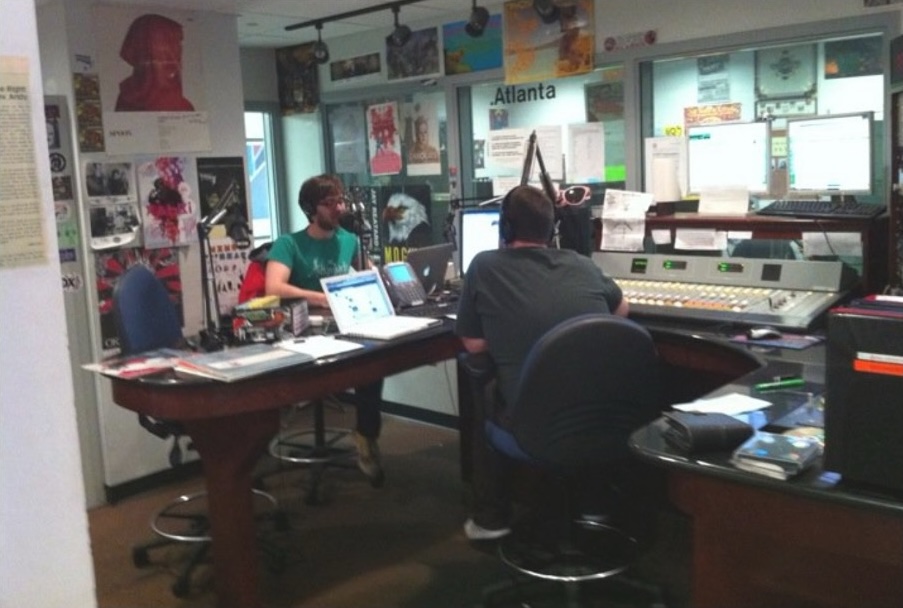
Me and my older brother, "DJ Adam Bomb," doing our DeVore Family Christmas special on WRAS

For three years, I selected the songs heard in the station’s album-based regular rotation. I also hosted Soul Kitchen, a 2-hour weekly retro soul and funk program, as DJ Freight Train. I met many close friends and made some of my fondest college memories while working at Album 88.

29 Aug 2013
Dumpster Dive

Promo for WRAS Atlanta’s Dumpster Dive

Dumpster Dive was a free outdoor concert in downtown Atlanta organized by WRAS Atlanta. It got its name from its unusual venue — a road beneath Courtland Street, literally in front of some dumpsters. It featured performances by TV Dinner, TWINS, and Blunt Fang.

I illustrated the four Dumpster Dive rats and used them any chance I got, such as these handout and poster designs. We even screen-printed limited edition t-shirts.

Dumpster Dive Handout
Dumpster Dive Poster

I also produced the radio promo, where I voiced a few twisted rats.

If you’d like to see more of my style, view my other illustrations on Instagram.

24 Jan 2013
Classic City Rollergirls

Promo for the Classic City Rollergirls

What’s better than badass women on roller skates? Being married to one of them.

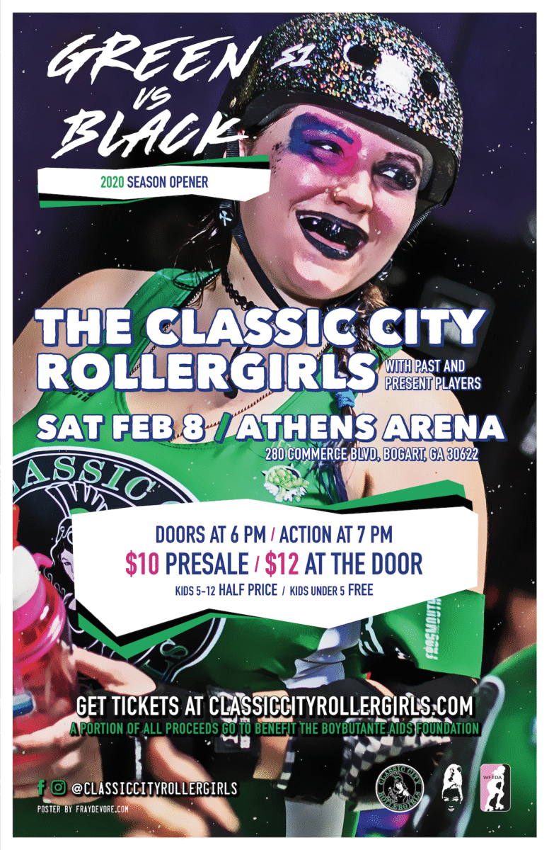
Naturally, I was happy to help out Athens Georgia’s professional roller derby team, the Classic City Rollergirls, with their promotions. Here are a few examples:

Poster

2020 Poster for the Classic City Rollergirls Green vs. Black Bout

Bar Coasters

2020 Schedule Coaster for the Classic City Rollergirls

Social Media Image

Percentage Night Promo

There were only loose brand guidelines, so I referenced existing materials to guide my hand: the logo, team colors, and previous poster designs accessed from the Classic City Rollergirls Archive.

Oddly enough, I had to be careful with the “punk rock” aesthetic that many associate with roller derby, as it is becoming phased out. Since the sport is leaving its adolescence, many teams are opting for a more “pro sports” aesthetic to establish themselves among other professional leagues.

21 Jan 2013
Old Scout Anti-Ransomware Video Thumbnail

Motion Graphics

Here are a few examples of the many animated product videos I made for Safe Systems. In each, I was a one-person production team, handling the storyboarding, animations, timeline editing, and sound design.

20 Jan 2013

Live Action Videos

Here are a few examples of the many interview-style videos I made for Safe Systems where I was a one-person production team.

I handled the storyboarding, lighting, camera work, audio capture, timeline editing, sound design, color correction, and custom motion graphics.

03 Jan 2013
Magazine ads for Safe Systems

Corporate Collateral

Magazine ads for Safe Systems

I was hired at Safe Systems in 2014 and was responsible for developing and overseeing what was then the new brand identity guidelines.

For the next decade, I designed hundreds (if not trillions) of brand collateral, including:

  • logos
  • brochures
  • presentations
  • custom mailers
  • print and digital ads
  • event environments
  • trade show signage
Swag for NetConnect, Safe Systems's users conference

I worked closely with our engineers and regulatory experts to create content, often filling in as copywriter as well.

This taught me how to consolidate technical and dense concepts into approachable and efficient language. Here are a few white paper layouts where that skill definitely came in handy.

A variety of white paper layouts

I was a part of a small Marketing department. Out of necessity, I became fully trained in the inbound marketing strategy and eventually HubSpot-certified.

In HubSpot, I regularly prepared mobile-responsive marketing emails, like the ones below, often using custom CSS to get everything just right.

A variety of responsive email layouts

I’ve become adept in software I would’ve never otherwise considered. I’m looking at you, PowerPoint.

Slide layouts

This job allowed me to explore the full gamut of corporate collateral. It’s a corner of design I’m now quite comfortable with and yet I’m still finding new things to learn all the time.