Here are a few examples of the many animated product videos I made for Safe Systems. In each, I was a one-person production team, handling the storyboarding, animations, timeline editing, and sound design.
21
Jan
2013

Here are a few examples of the many animated product videos I made for Safe Systems. In each, I was a one-person production team, handling the storyboarding, animations, timeline editing, and sound design.
Here are a few examples of the many interview-style videos I made for Safe Systems where I was a one-person production team.
I handled the storyboarding, lighting, camera work, audio capture, timeline editing, sound design, color correction, and custom motion graphics.
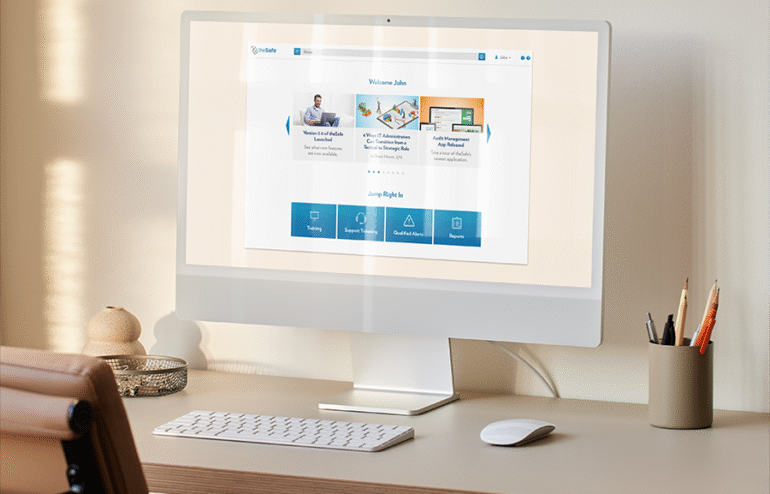
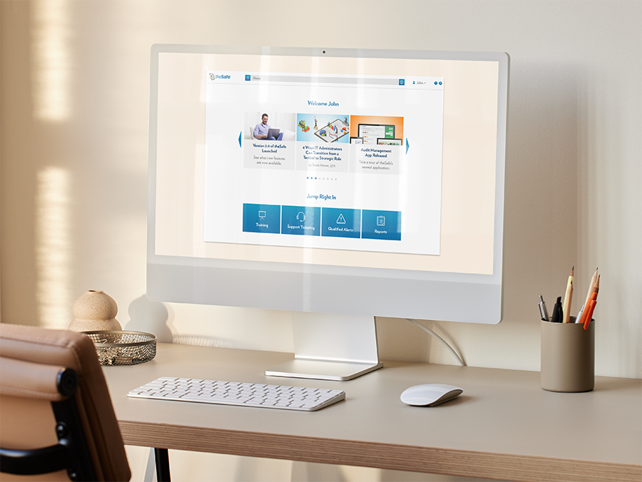
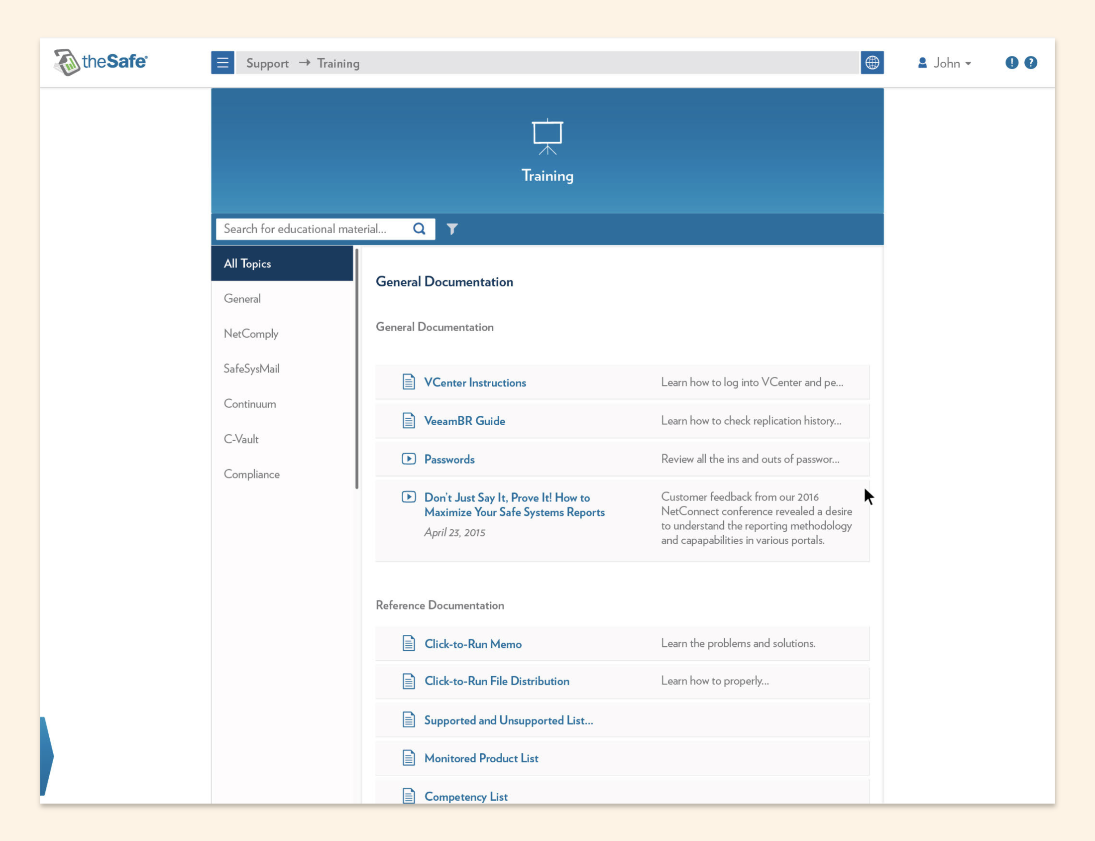
For 10 years at Safe Systems, I was the sole creative, but I wasn’t alone. I worked closely with the Development team to completely revamp our user portal, “theSafe.”
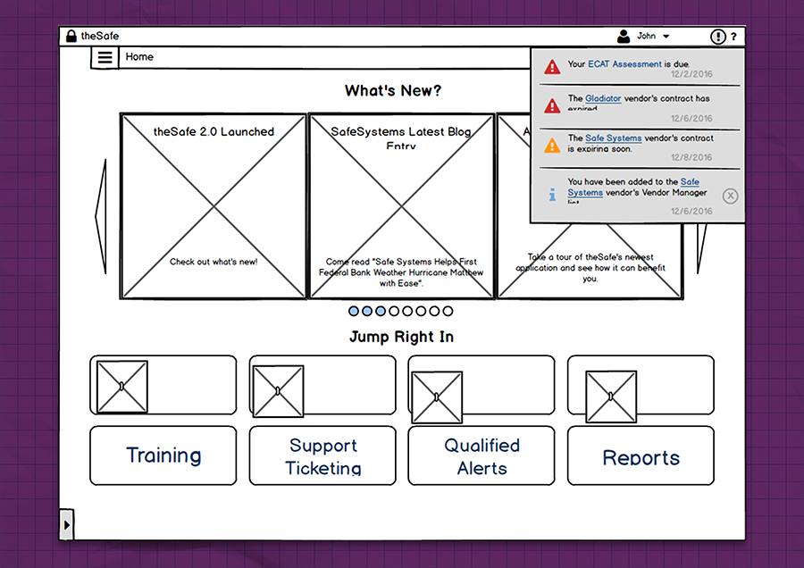
This thing needed some help. It was stuck in 1995.
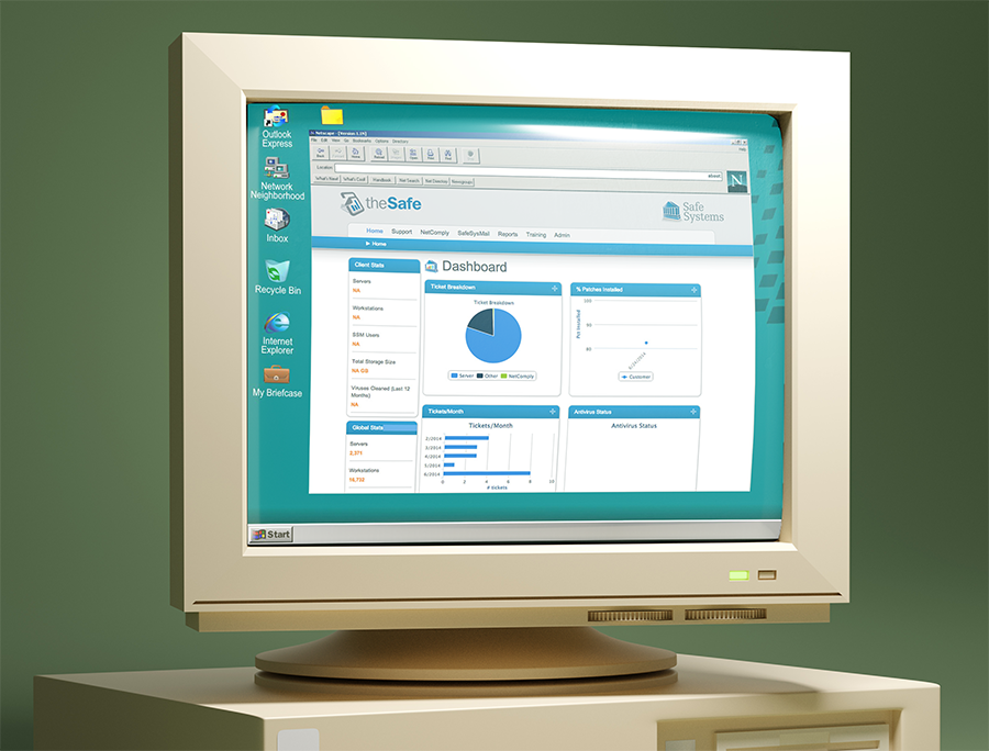
Okay. I photoshopped that, but the screenshot is real!
This was supposed to be our flagship software. This was where banks monitored their IT infrastructure, grabbed regulatory reports, and accessed security trainings. It deserved a secure, flexible, and modern design.
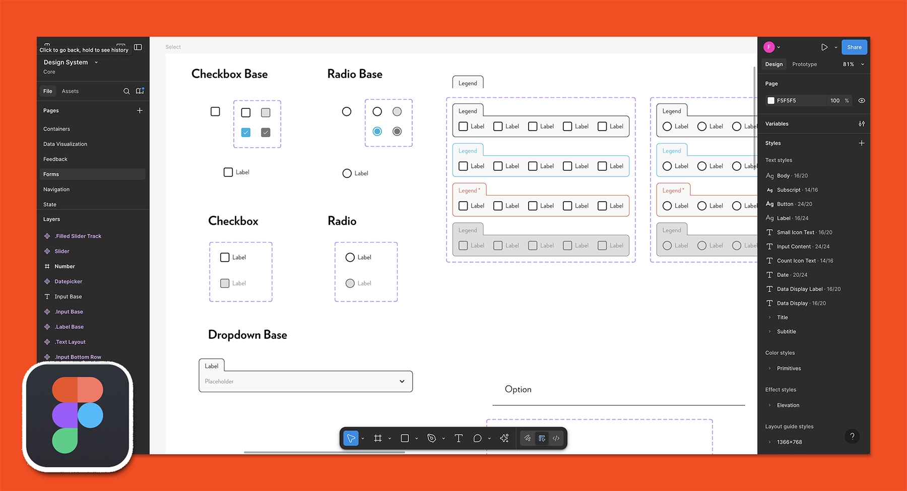
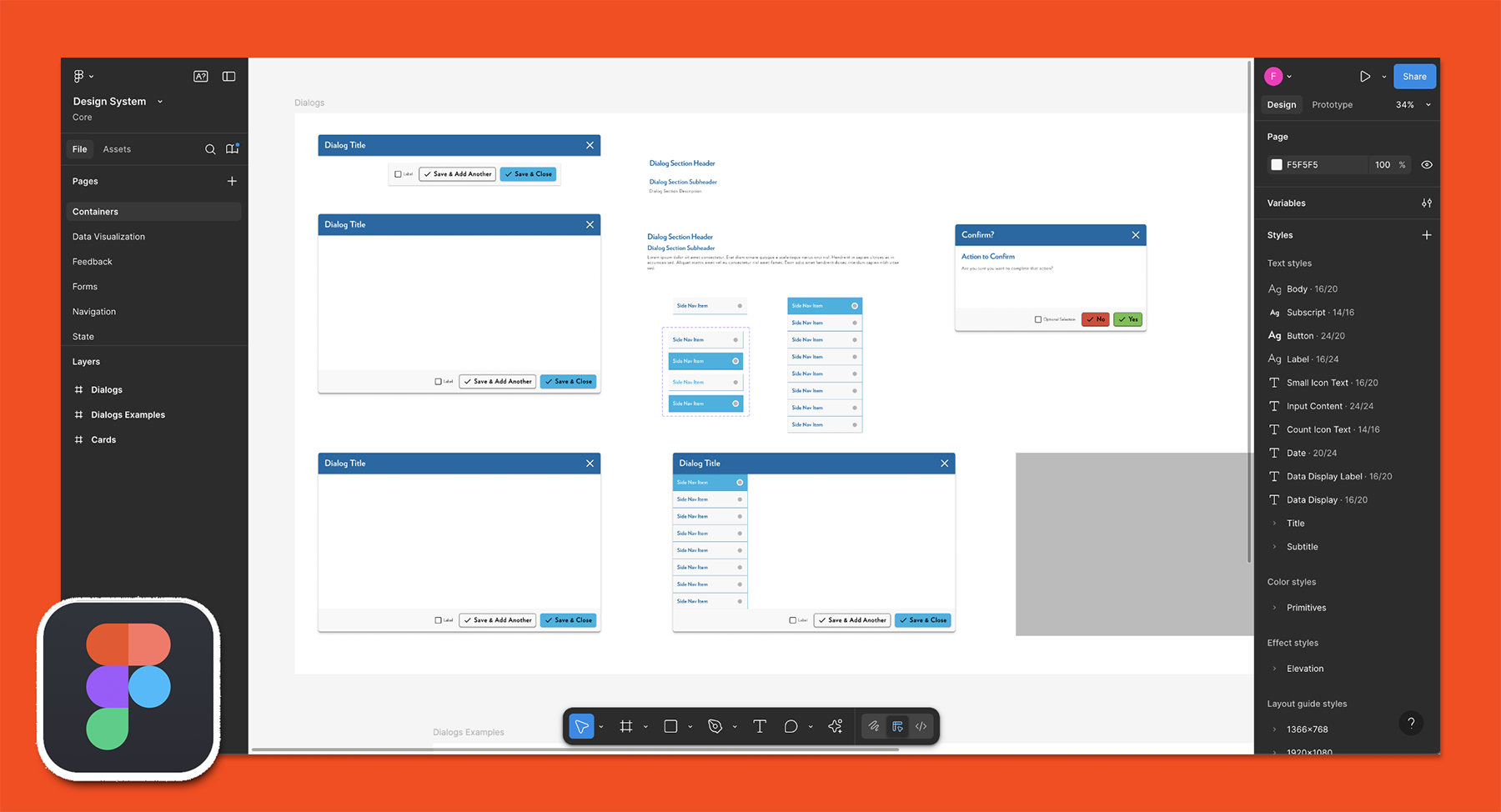
So, the developers and I discussed its strengths, weaknesses, and must-haves. We defined the user stories and flows, and eventually made wireframes like this:
Not the prettiest, but just what I needed to produce the prototypes that would begin to define the new UI, design systems, reusable components, and page layouts.
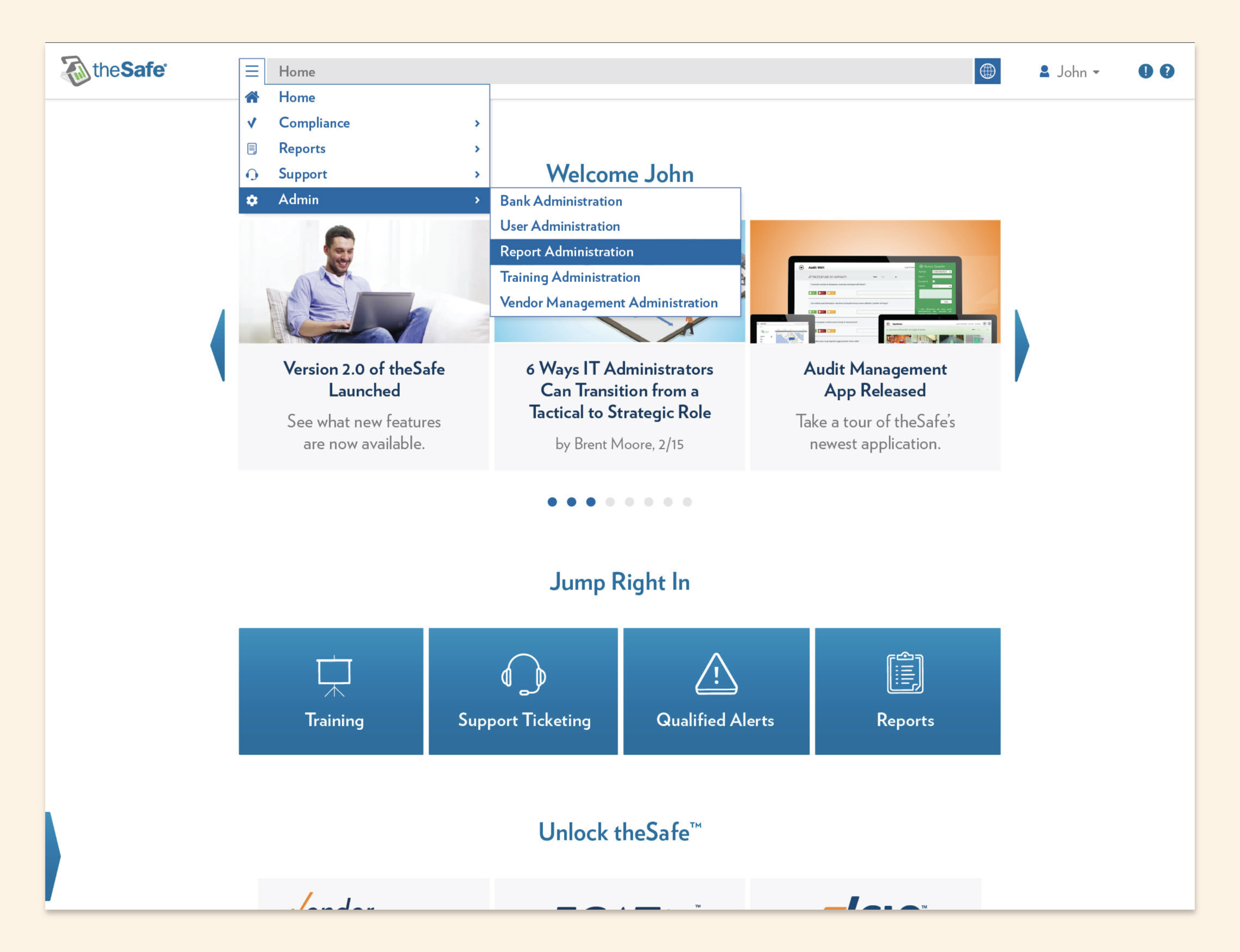
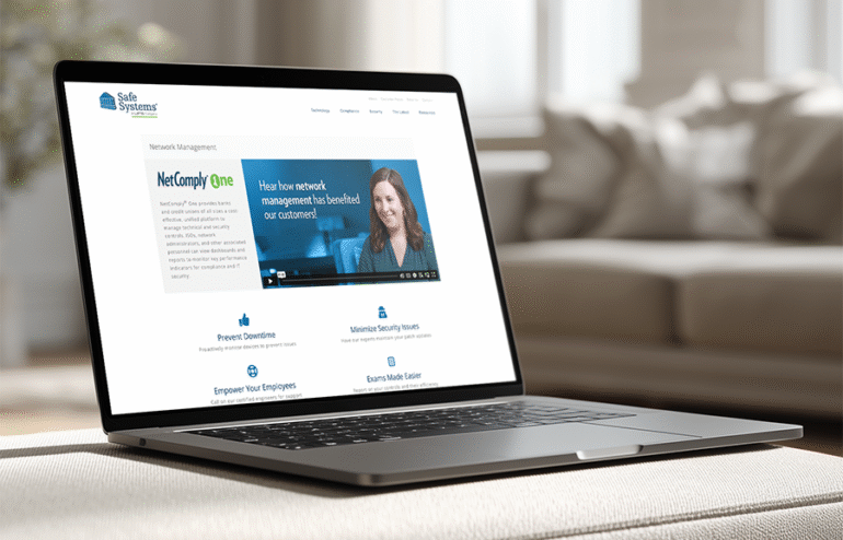
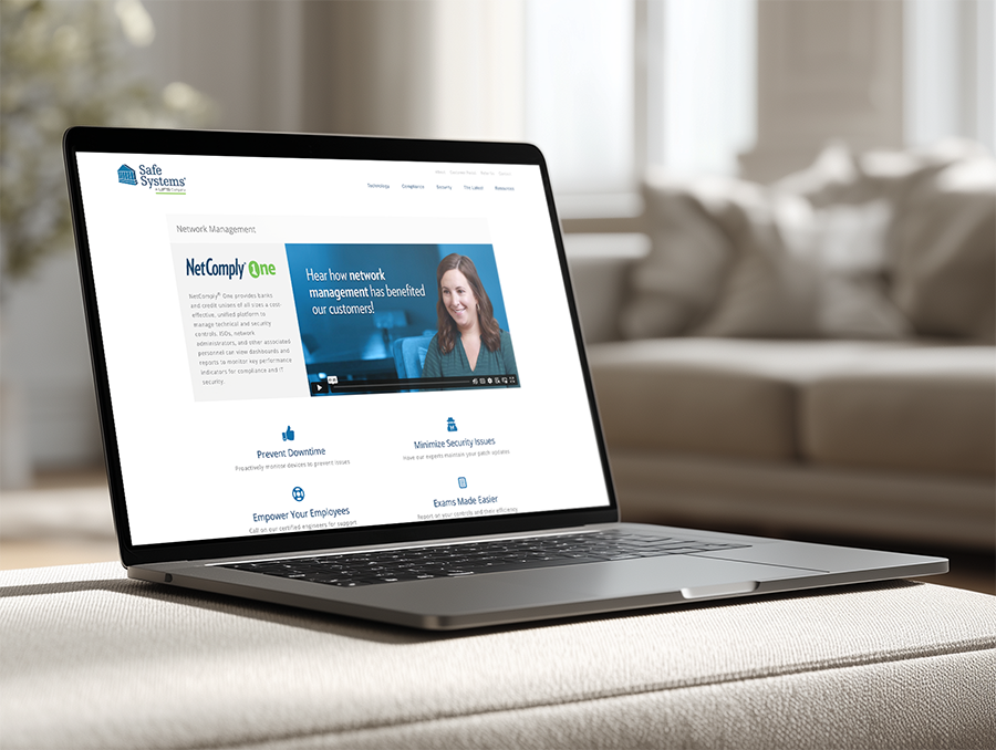
In the end, simple wireframes like that turned into this:
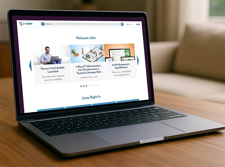
Looks aren’t all. It was also coded to have blazing fast page speeds and intuitive responsive design for mobile and tablet viewports.
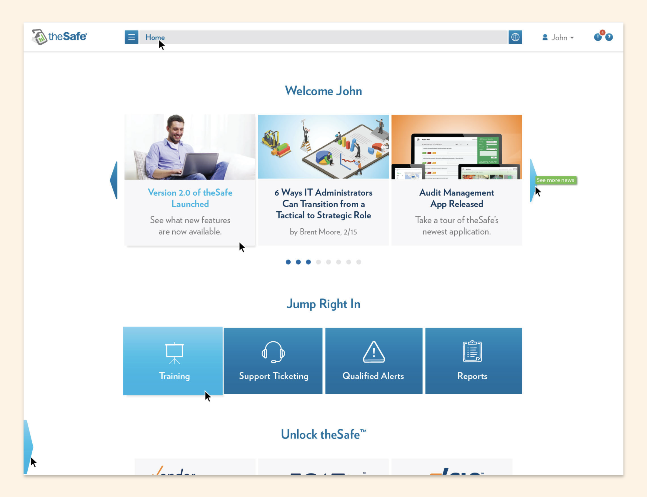
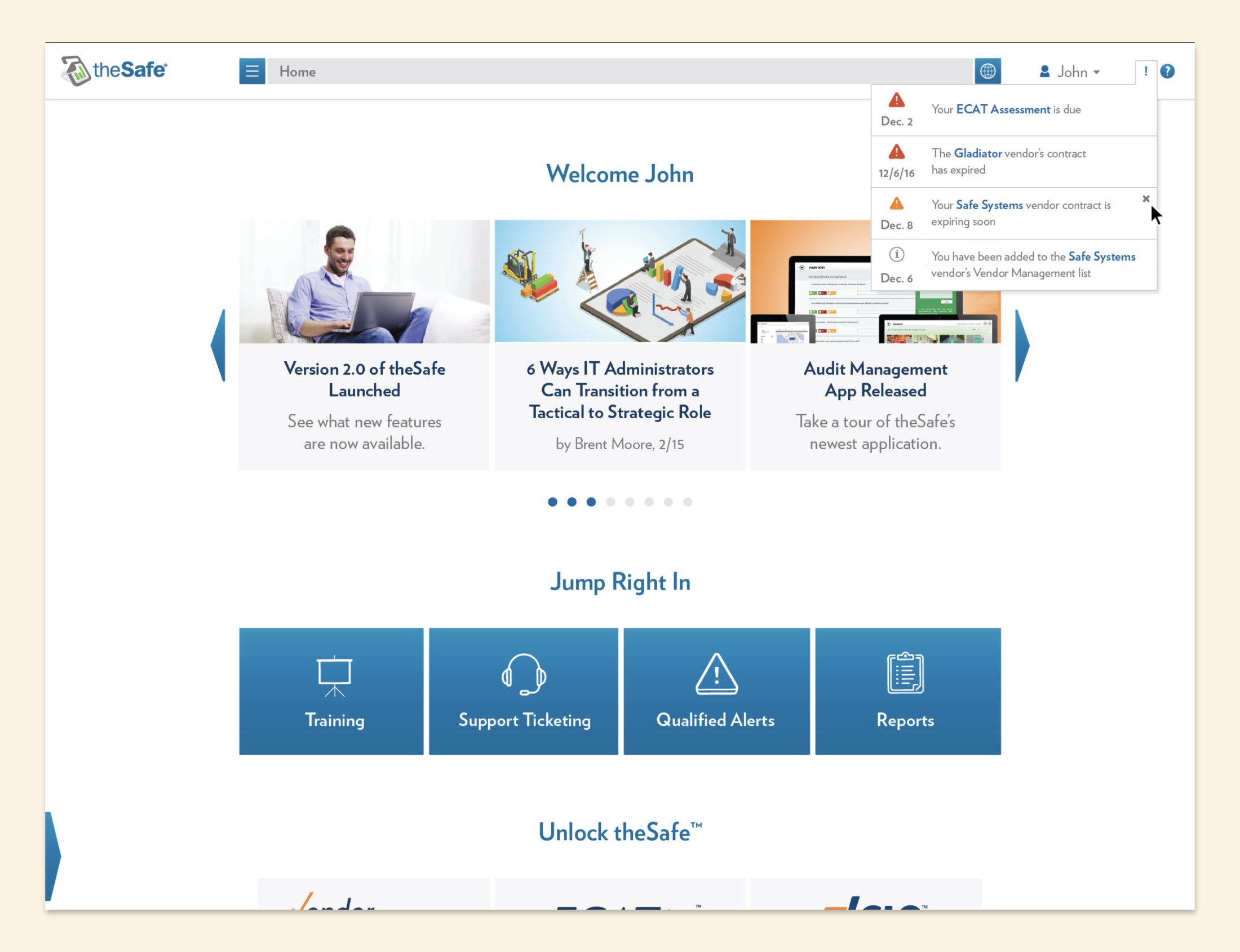
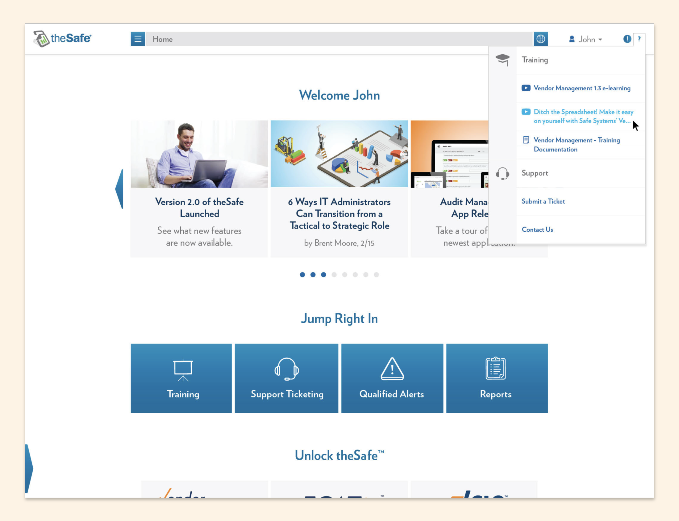
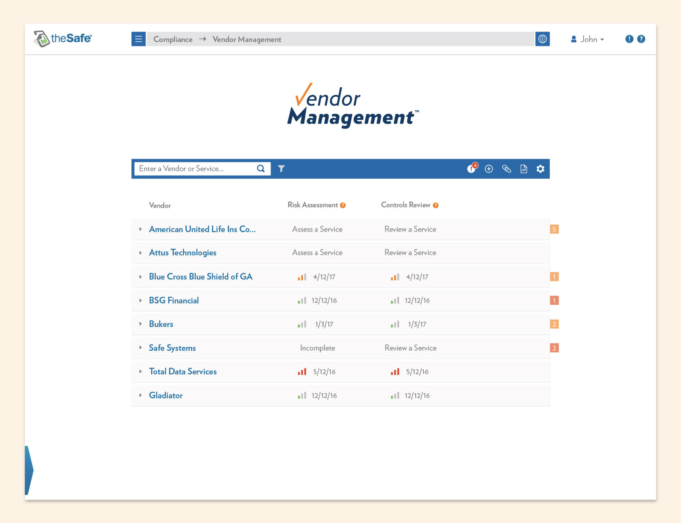
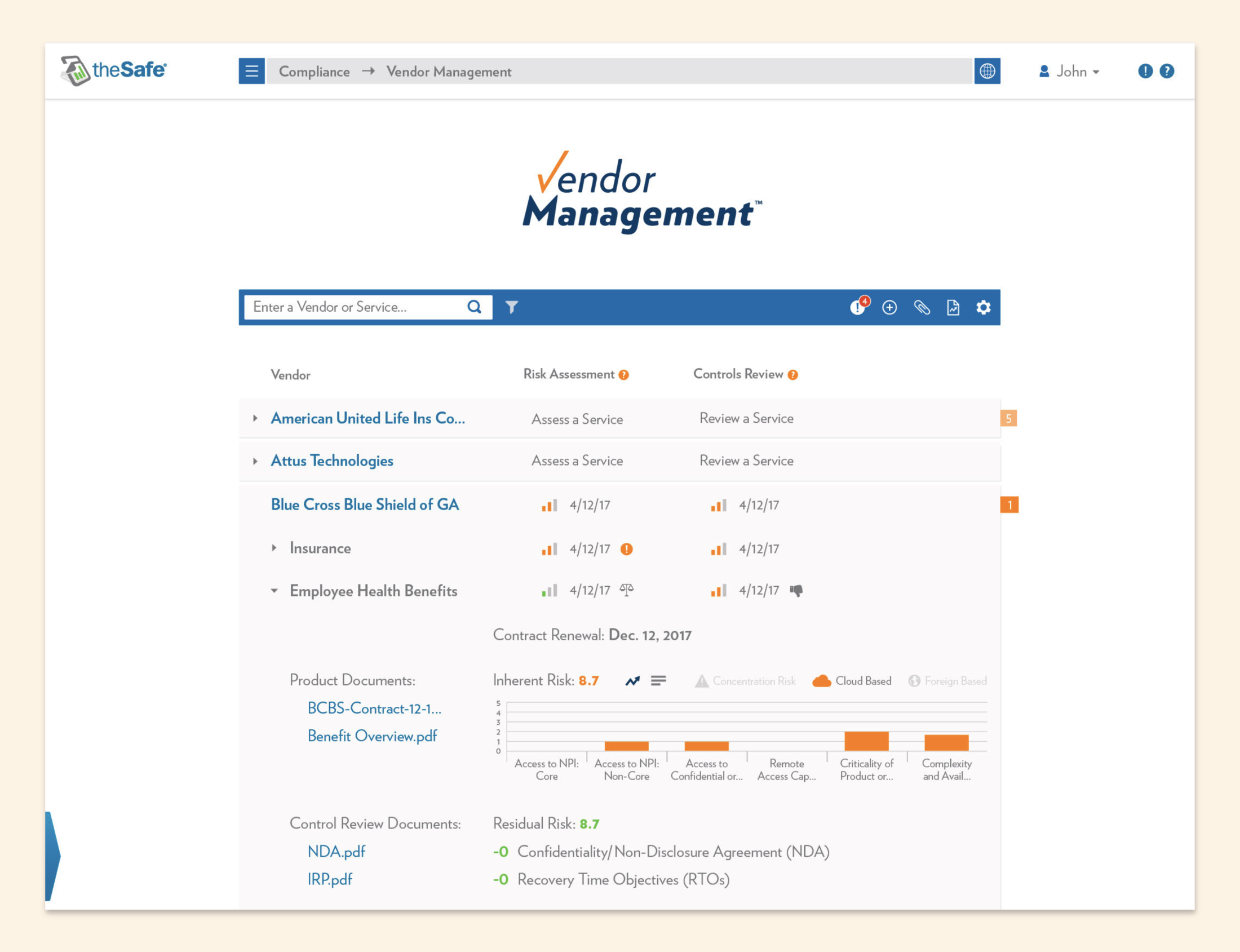
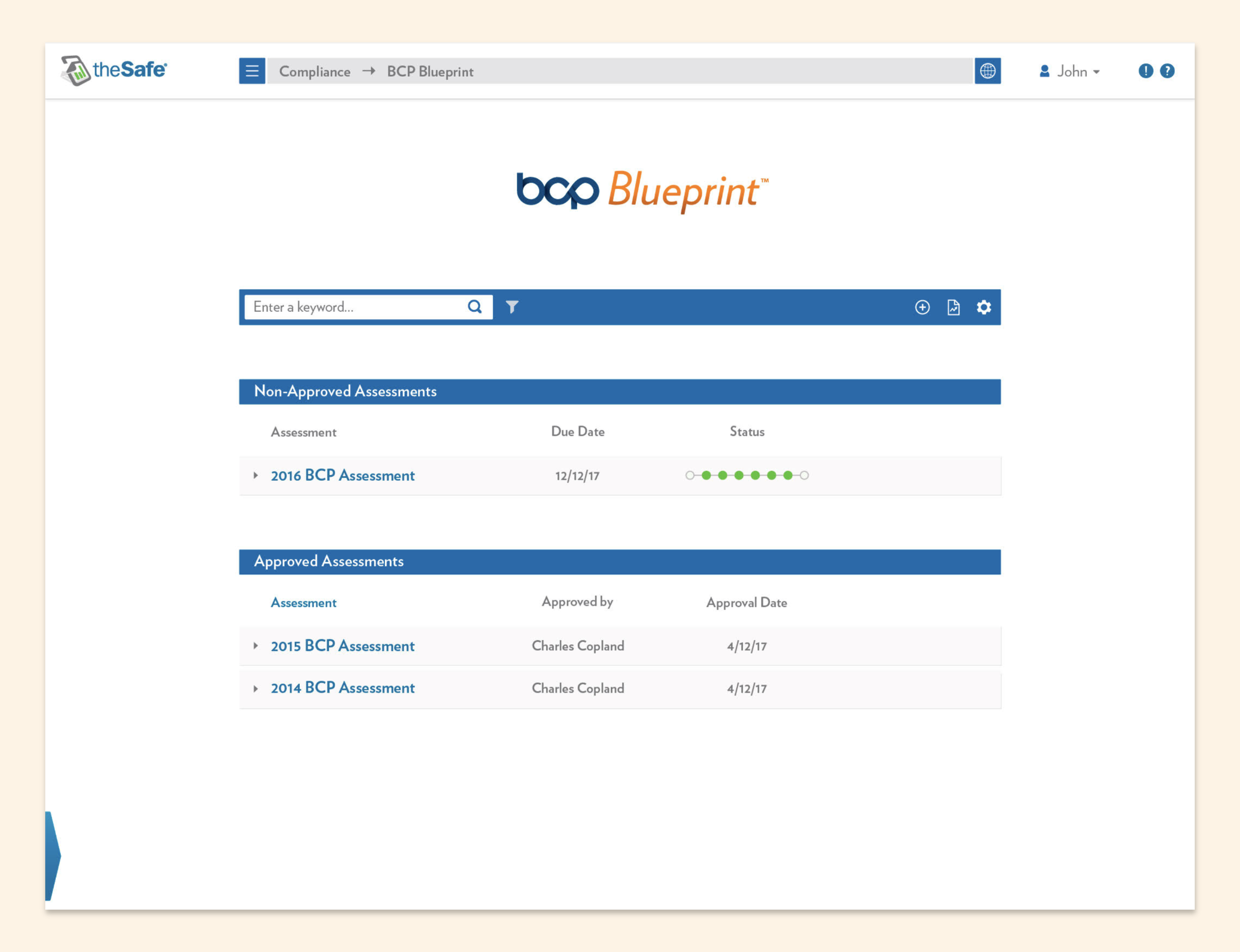
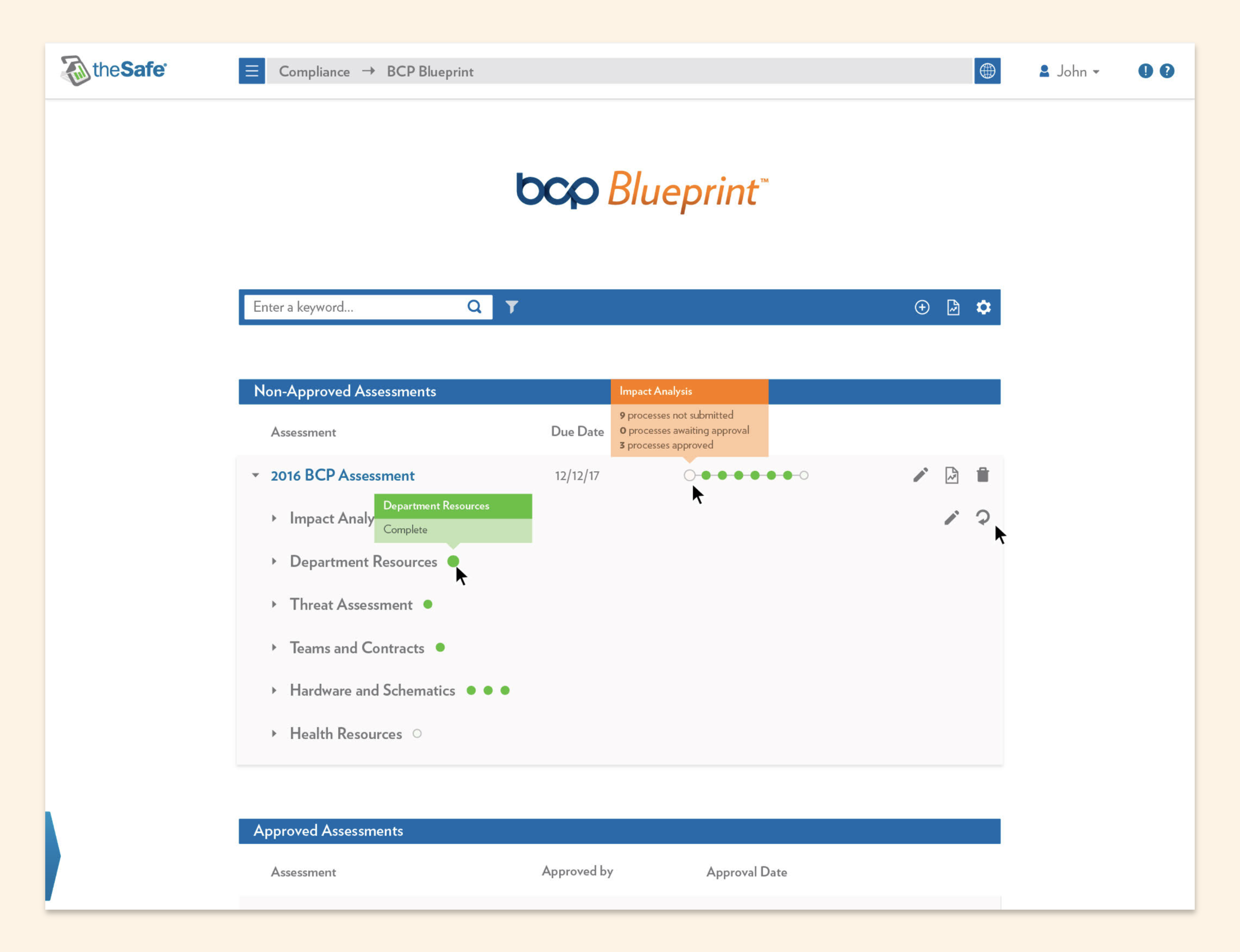
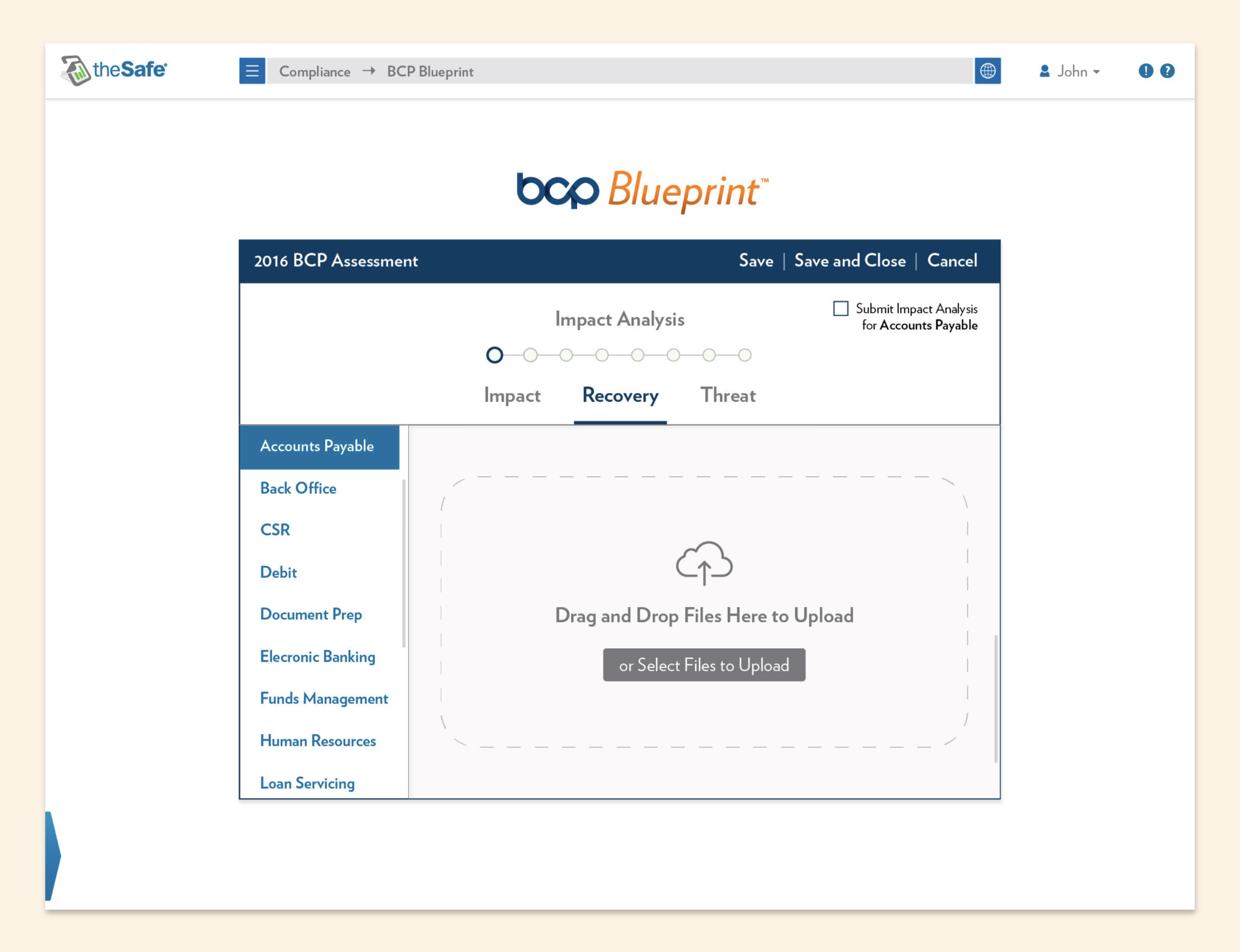
Stylized mockups don’t really show the whole picture, so here is a selection of screen captures below to demonstrate the breadth of work.
I was just Safe Systems’s senior graphic designer on paper, but the entire company website was also my domain (oof, a pun).
So, in addition to developing the brand identity, I also created the website’s UI/UX, design systems, reusable components, and page layouts.
Unlike the user portal, which was a custom development, the main website was built in WordPress. It was a jumping-off point, and I heavily altered the HTML to match my own outlandish standards.
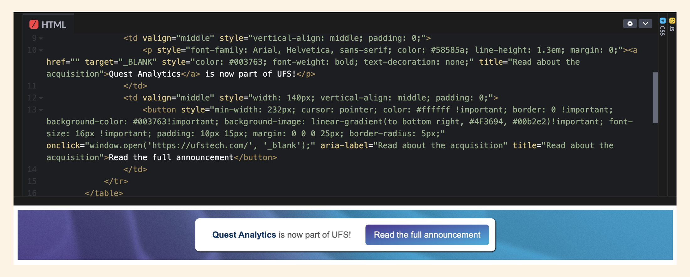
Here is an announcement banner I coded from scratch that features both CSS and JavaScript.
For many years, I also wrote and implemented SEO metadata and oversaw hosting maintenance, such as updating SSL certs and the PHP version.
It wasn’t just about looking pretty! I always kept responsive design, page speed optimization, and user flows top of mind.
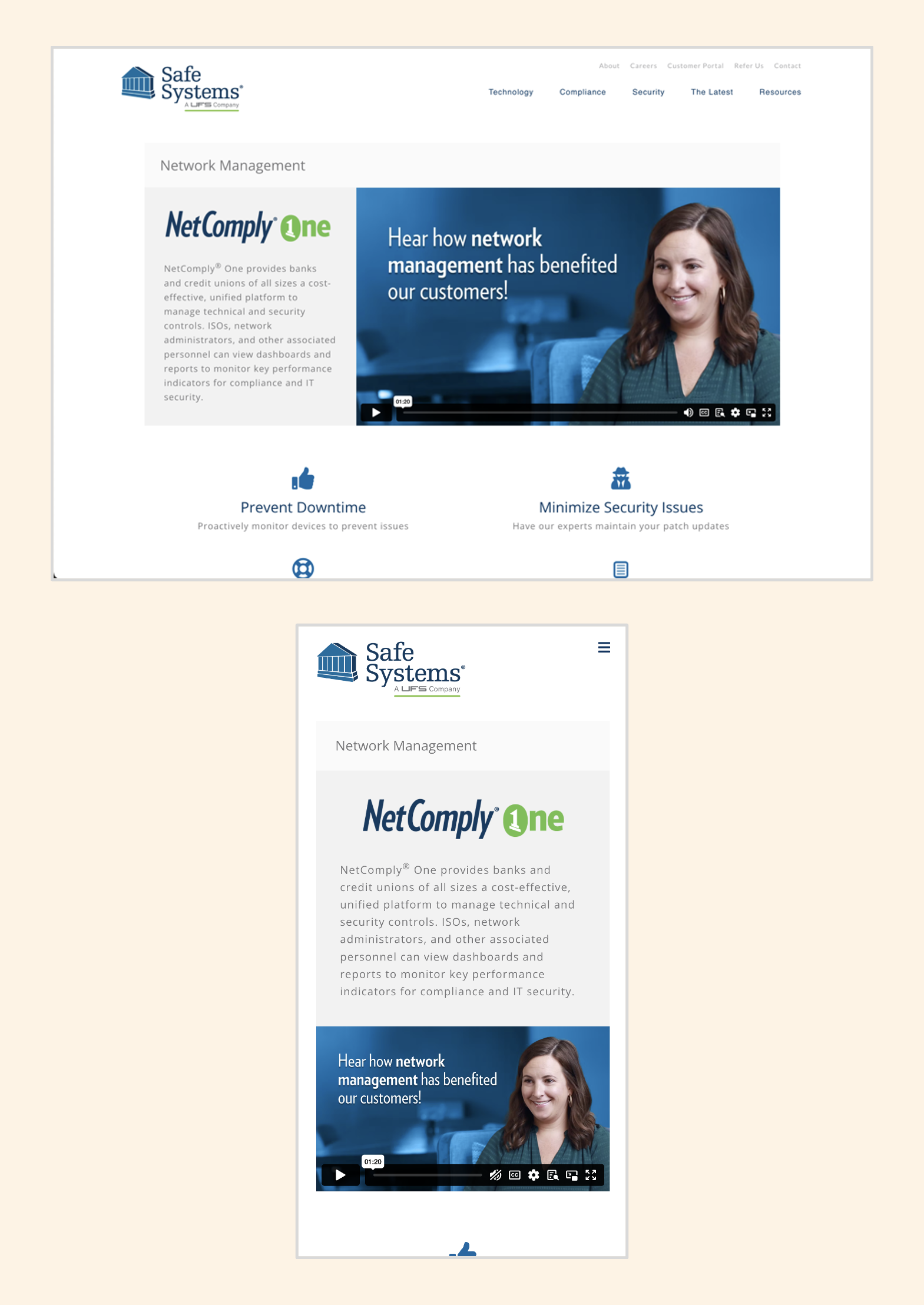
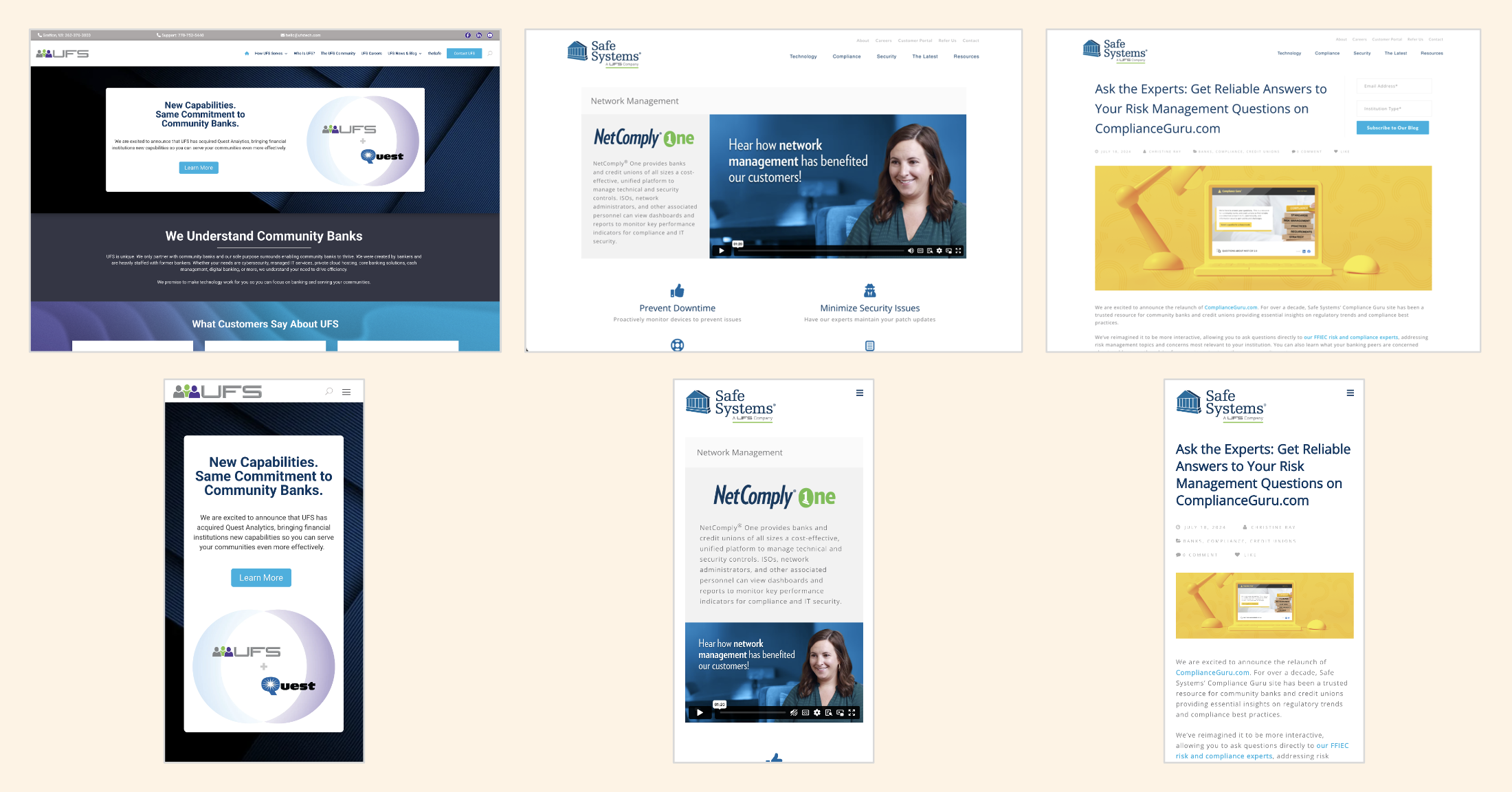
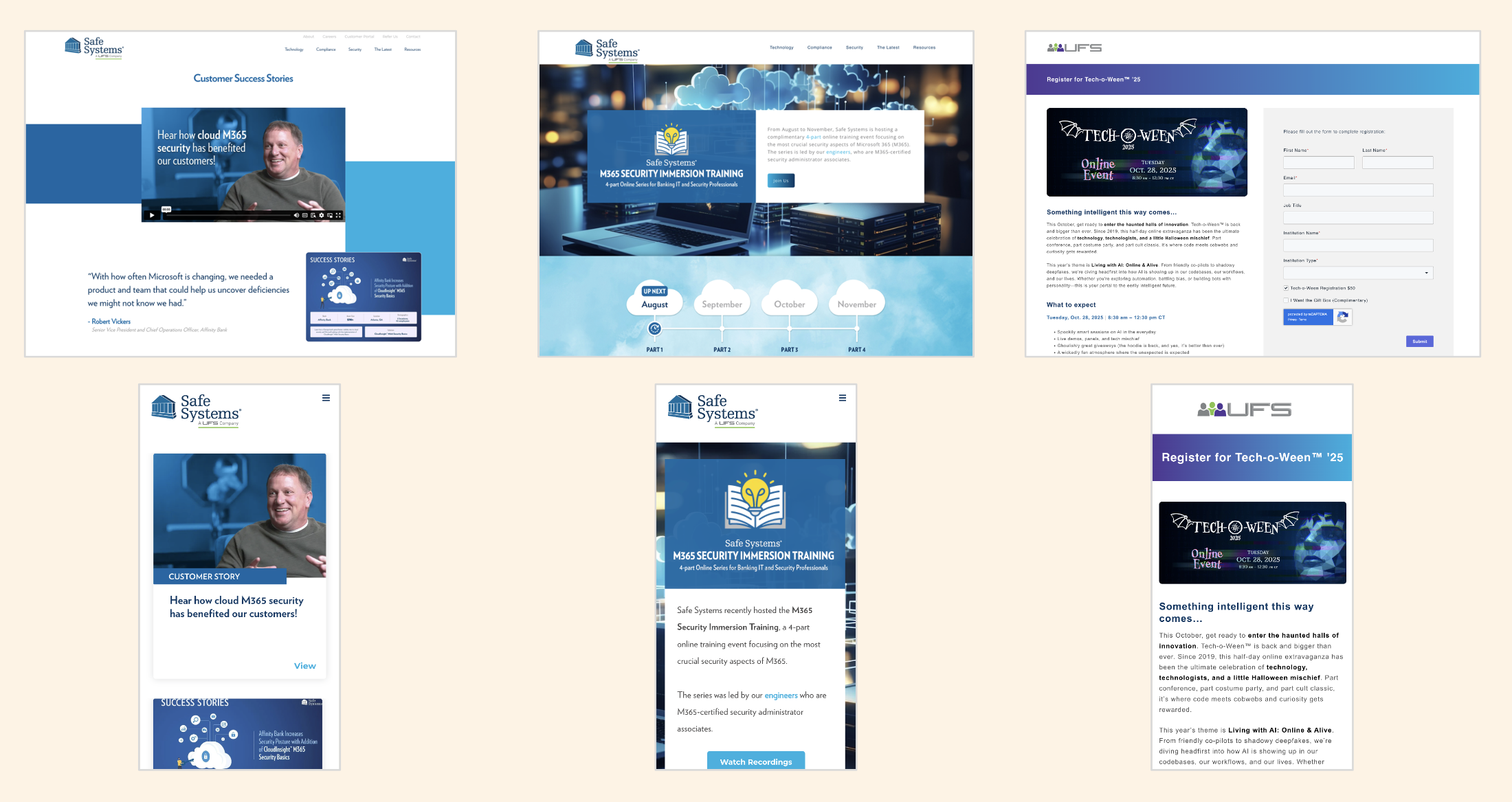
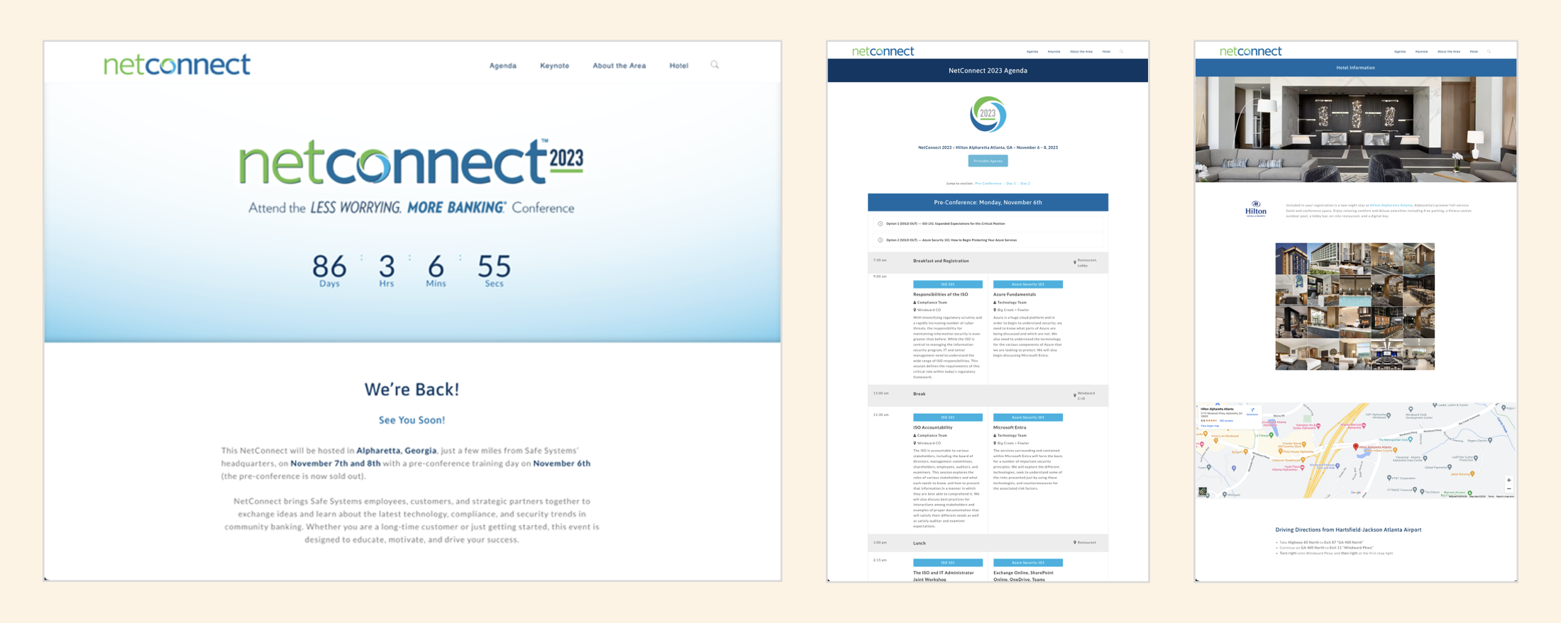
Below is an overview of page layouts I have designed, including product pages, blog posts, and event information hubs. These and many more can be found on the Safe Systems website.

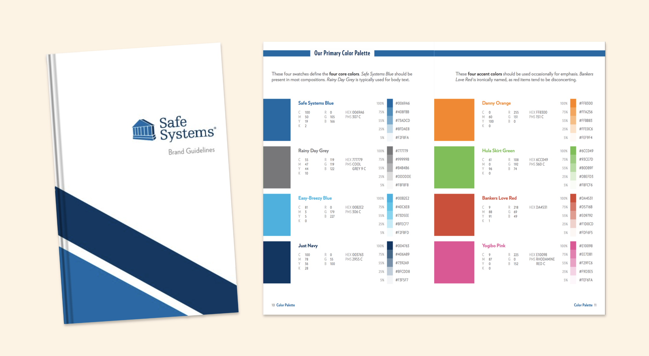
I was hired at Safe Systems in 2014 and was responsible for developing and overseeing what was then the new brand identity guidelines.
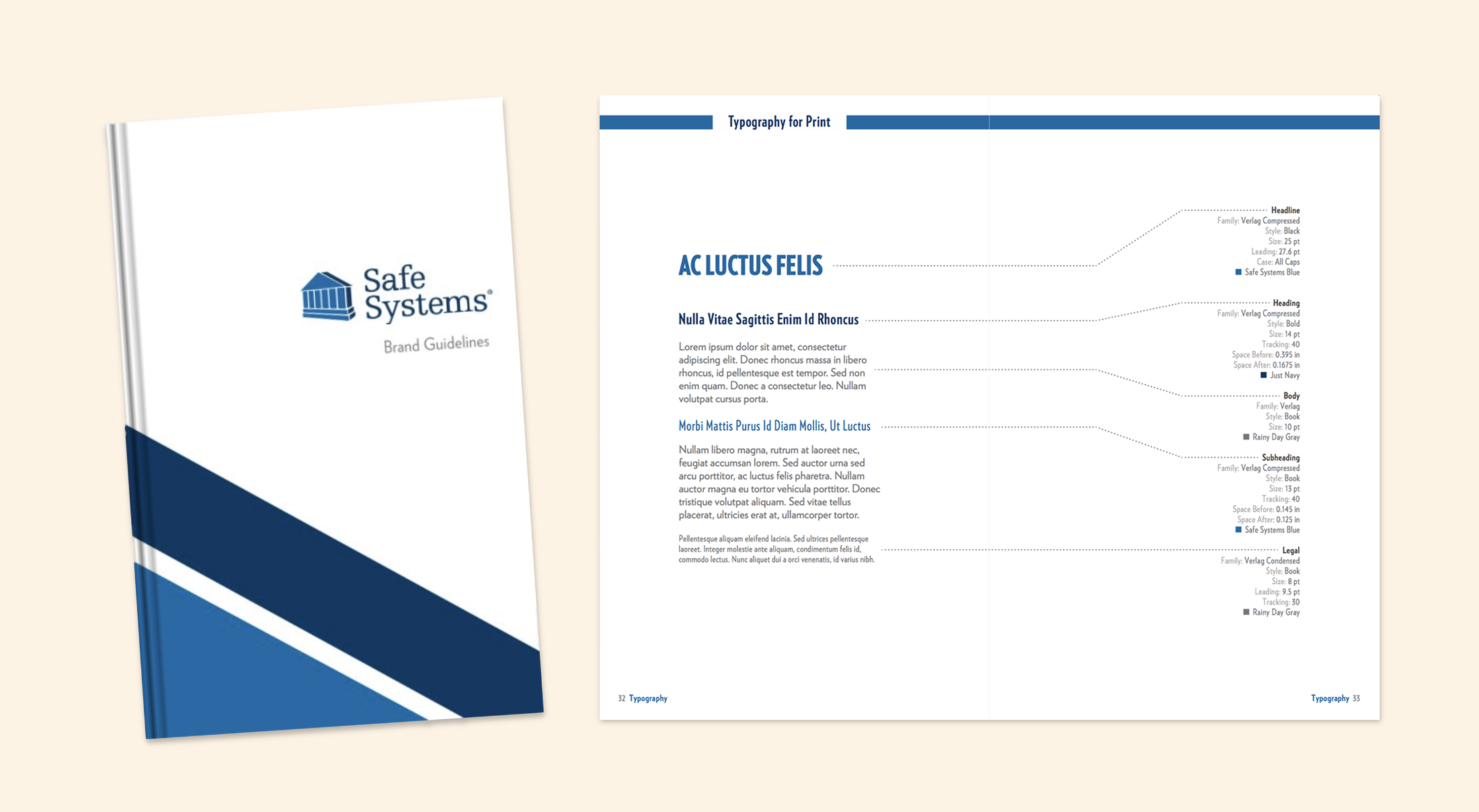
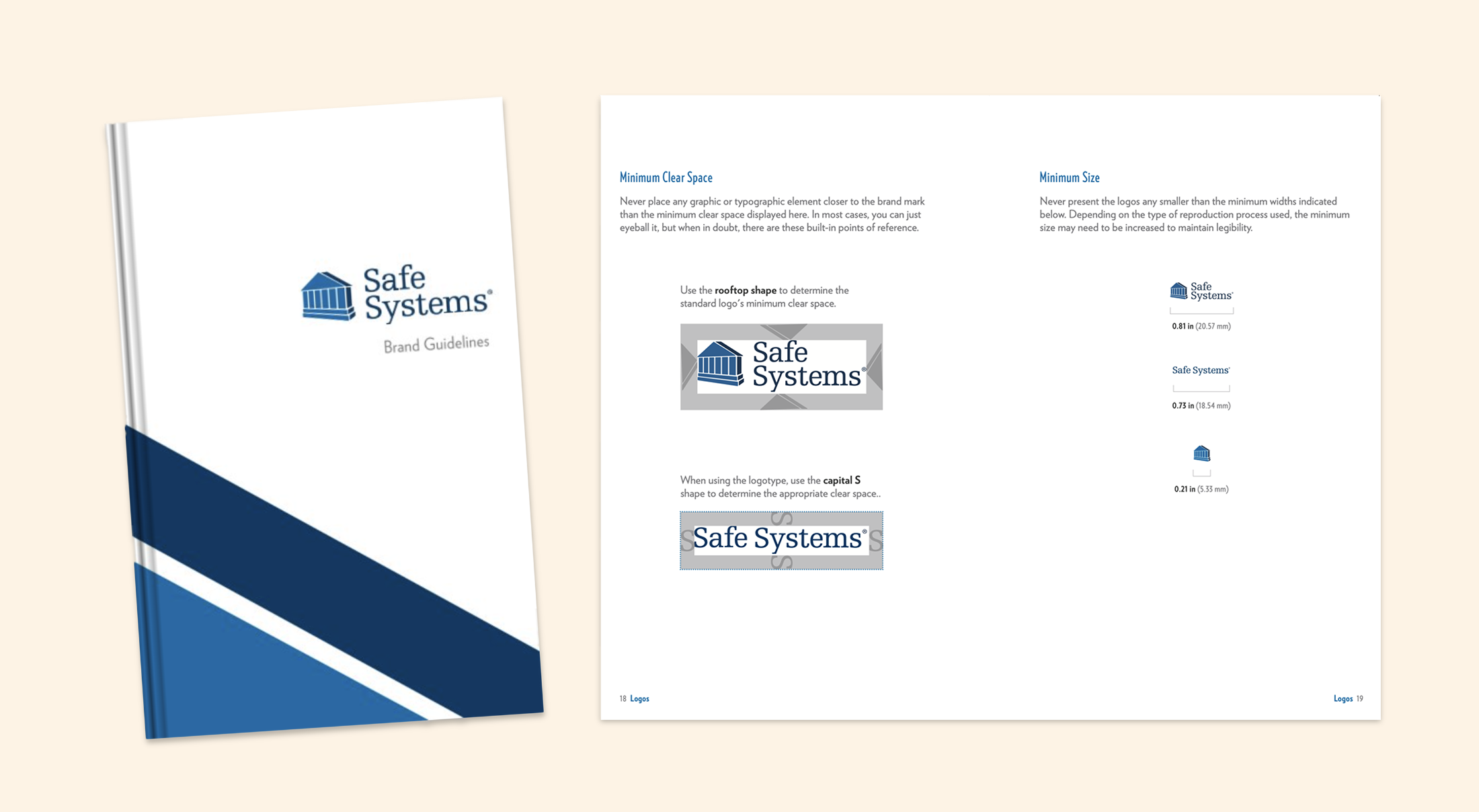
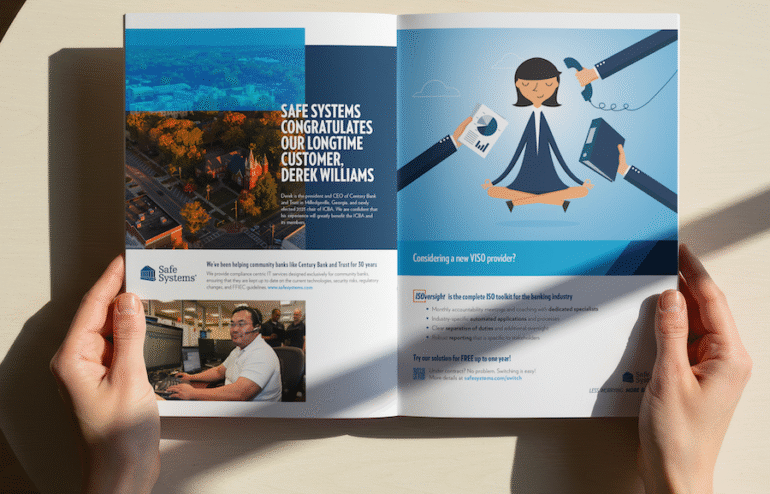
For the next decade, I designed hundreds (if not trillions) of brand collateral, including:
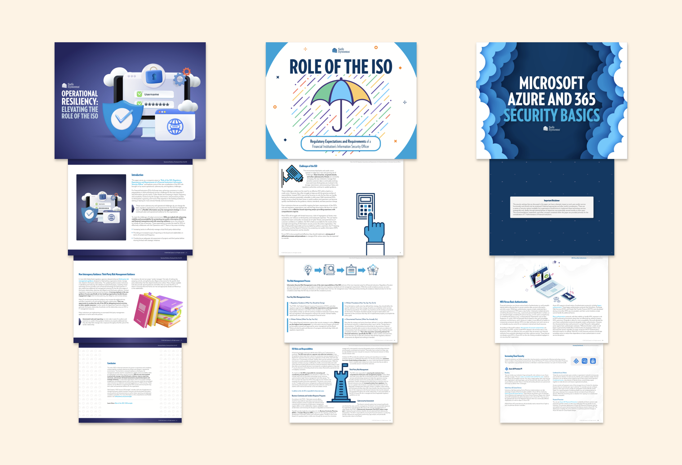
I worked closely with our engineers and regulatory experts to create content, often filling in as copywriter as well.
This taught me how to consolidate technical and dense concepts into approachable and efficient language. Here are a few white paper layouts where that skill definitely came in handy.
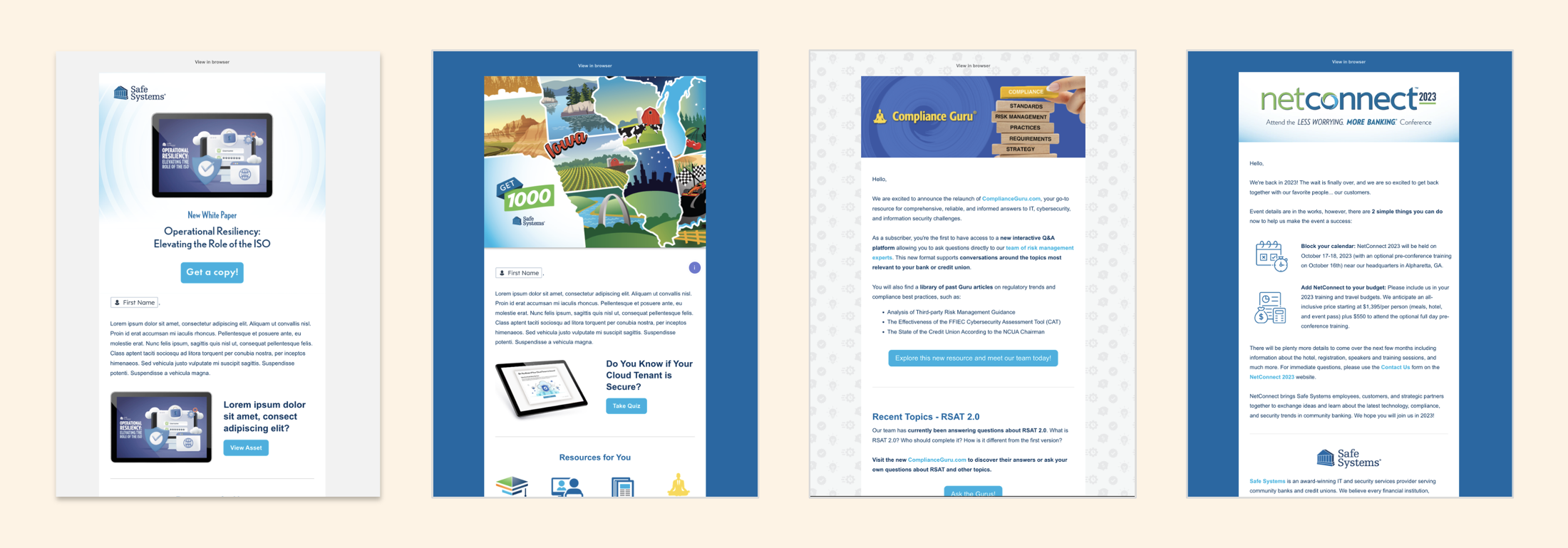
I was a part of a small Marketing department. Out of necessity, I became fully trained in the inbound marketing strategy and eventually HubSpot-certified.
In HubSpot, I regularly prepared mobile-responsive marketing emails, like the ones below, often using custom CSS to get everything just right.
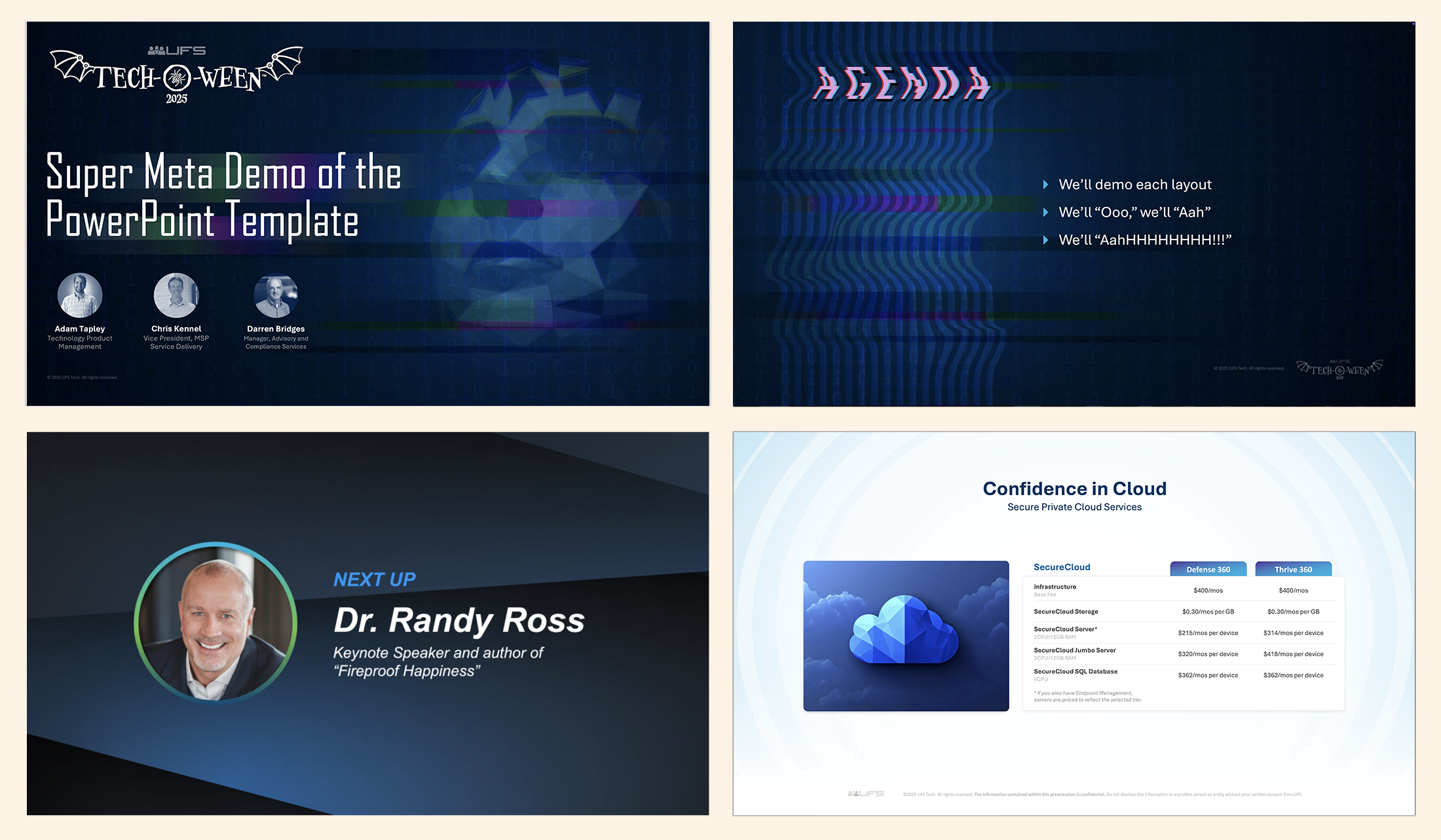
I’ve become adept in software I would’ve never otherwise considered. I’m looking at you, PowerPoint.
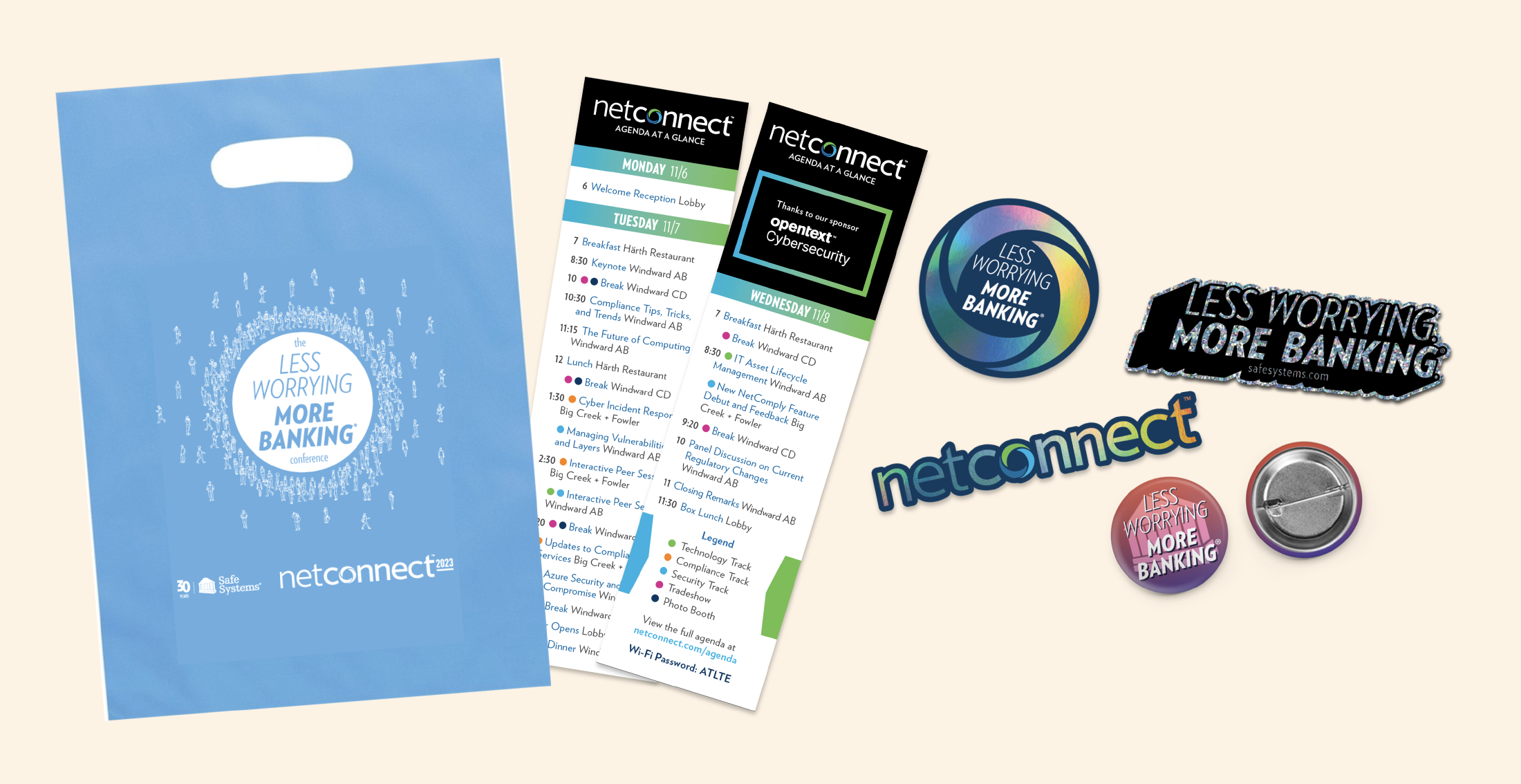
This job allowed me to explore the full gamut of corporate collateral. It’s a corner of design I’m now quite comfortable with and yet I’m still finding new things to learn all the time.

 © 2025 Fray DeVore. All rights reserved.